You might notice there are a few tiny changes around here… you know, minor ones.
The fundamental problem with the old faucet layout was its inflexibility. Don’t get me wrong, I loved it, but as the site evolved, and as my purpose with the site evolved, the layout became increasingly inappropriate. As my photography started gaining momentum I wanted my photos to have a more prominent role in the site, and with the faucet layout there just wasn’t any place to do that. Also, I recently found out that the great majority of my readership has no idea that I am a musician first and foremost, and the reason they don’t know is because with the old layout, there was absolutely nothing to indicate anything musical about me, nor was there any room to add anything like that in. In fact, the layout was so restrictive, that even the blog content was pretty much strangled down to a single category, because nothing else really made sense in that visual context.
With that in mind, I started working on a new layout a few months ago, but… I don’t know, it just failed miserably. For all the hours and hours of work I put into it, in the end it was suspiciously like the faucet layout— not aesthetically, but in structure. Still no room to grow, still no way to give any hint about where I think this site is going.
So, with a heavy heart, I took that new layout and I trashed it. The whole thing, just dragged the folder over to the trash. And then I quickly emptied the trash so that I wouldn’t be tempted to change my mind.
It took a couple of months for me to get over that breakup. The thought of staring at an empty text file titled “index.php” and knowing that I had to write everything from scratch all over again was a bit much to handle at that point. Normally I look forward to a new project with excitement, but this wasn’t a new project— it was a redo of an old project.
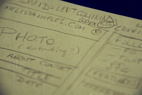
After giving myself some time to regroup, I came back to the table with some truly fresh ideas, and even a plan or two. Instead of heading directly into writing code, which is what I usually do, I started out with what I wanted to have happen visually. I actually storyboarded the site before I ever got near the text editor, and I think that made all the difference.
Anyway, I hope you like the result.
Changes that have already happened:
- New look, in case you hadn’t noticed;
- Three columns – more room for stuff;
- Everything has its own place, and there’s potential to expand;
- Ads are gone – Google has failed miserably to provide my readers with advertising content that might be relevant to this site. The moderate amount of income I get from the ads is neither here nor there, and I’m happy to live without it if we never have to look at another crazy diet scam ad again. I will probably look for other ways to monetise, but if and when that happens, whatever I choose will make sense within the context of the site;
- Cleaned up my links – I had so many links on blogroll where I either had no idea what the linked site was about, or in some cases the sites were actually dead. I’ll be building this list back up with links to content that is relevant to what we do here;
- The “like” button – I’m a huge fan of Facebook’s “like” feature— it’s a much easier way to let an author know you like something without having to make a ridiculous “I like this” comment, which no one ever bothers with anyway. One click, and you’re done;
- Polls – wait, what? Yes, you heard right. Extremely fun and deliciously time-wasting polls.
Still-brewing features to be rolled out over the next couple of weeks:
- New posting categories – we’re going to start talking about stuff, lots of different stuff;
- Changes to subscriptions – Feedburner has taken a very unfortunate nosedive since the move to Google (again with the GoogleFail), and the whole thing has left a very bad taste in the mouths of a lot of feed owners like myself. I think the lesson here is that if you have the available bandwidth to handle distributing your own feeds (which I do), then trusting a third party to do it is probably not the smartest move. I just have to work out a few logistical things first, but then we’re going to start moving everyone back home to the native feeds;
- More options for people who prefer e-mail – e-mailed feeds, and options to have follow-up comments e-mailed to you in threads you’d like to follow;
- More stuff in the Features and Projects sections, and rotating content in both places;
- Major changes to the way comments are handled – I’ll be switching us to nested comments within the next day or so (finally, thank dog), and then we’ll have some teething to go through with that, no doubt;
- A few aesthetic tweaks – there are a few things I don’t completely like the look of, but I’ll fix them as I encounter them. No biggie.
I’m going to need your help with a lot of this stuff— giving feedback when you find things that are broken, and so forth. But just bear with me for the moment… I’m still working out the kinks, and I do know that a few things need fixing. The contact form is borked at the moment, for instance, and that’ll just have to stay down for a couple of days until I get around to unborking it. Do let me know if anything is seriously broken for you, though, like to the point where the site is completely unusable. Be sure to mention what browser and OS you’re using.
And that’s all I have to report at the moment. I had a lot of fun making this layout; I hope it increases your enjoyment of the site.
Oh, and if you don’t like the look of the header image up at the very top… don’t worry, you’ll get a new one next time you visit a page.